

Colour choices play a significant role in shaping perceptions and emotions. The psychology behind colour choices reveals how different hues can influence mood, behaviour, and decision-making. This understanding can be particularly useful for marketers, designers, and anyone seeking to create a specific emotional response.
Research in colour psychology shows that certain colours are associated with particular feelings or concepts. For example, blue often evokes calmness, while red can stimulate excitement or urgency. By recognising these associations, individuals can make more informed decisions about the colours they choose for various applications.
Understanding colour perception and its psychological impact allows for deeper insight into how colour choices affect human interaction and engagement. This knowledge not only informs personal choices but also enhances effectiveness in communication and visual representation.
The Fundamentals of Colour Psychology
Colour psychology explores how hues influence human emotions and behaviours. By understanding how colours interact with mood and preferences, individuals can make informed decisions in design, marketing, and personal choices.
Understanding Colour Theory
Colour theory is a foundational concept that categorises colours into primary, secondary, and tertiary groups. Primary colours (red, blue, yellow) are the basis for all other colours. Secondary colours (green, orange, purple) result from mixing primary ones. Tertiary colours are created by mixing primary and secondary colours.
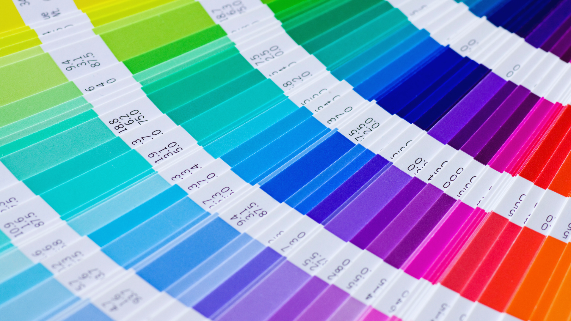
The colour wheel visually represents these relationships and aids in understanding complementary and contrasting hues. The lightness (or value) and saturation (or chroma) of a colour can significantly affect its psychological impact. Warm colours (reds, yellows) tend to evoke excitement, while cool colours (blues, greens) promote calmness.
The Spectrum of Emotions
Different colours elicit distinct emotional responses. For instance, red is often associated with passion and urgency, frequently used in branding to stimulate appetite or action. Blue promotes tranquillity and is linked with trust, making it popular in corporate environments.
Green symbolises nature and growth, promoting feelings of balance and renewal. Yellow can invoke happiness and energy, though its brightness may also create anxiety in excess. Understanding these emotional connections allows for strategic colour choices in various applications like marketing, art, and interior design.
Colour Preferences and Age
Age influences colour preferences significantly. Children are commonly attracted to bright, vibrant hues like red and yellow, which stimulate their energy and curiosity. As people mature, their colour preferences often shift towards more muted and sophisticated shades, such as navy blue or earthy tones.
Research indicates that cultural and environmental factors also play roles in shaping these preferences. Younger adults may favour bold colours for self-expression, while older generations might lean towards colours that evoke nostalgia. Understanding these trends aids marketers and designers in targeting specific demographics effectively.
Perception and Influence of Colour in Branding
Colour plays a significant role in shaping brand identity and influencing consumer behaviour. The right use of colour can enhance brand recognition, convey brand personality, and impact consumer perceptions.
Developing Brand Identity Through Colour
Brand identity is closely linked to colour choices. Organisations often choose specific colours to express their values, create a visual identity, and differentiate themselves in the market. For instance, blue often represents trust and dependability, making it popular among financial institutions. In contrast, red denotes excitement and urgency, commonly used in the food industry.
Furthermore, colour associations shape perceptions. A brand utilising green emphasises growth and sustainability, appealing to eco-conscious consumers. A consistent colour palette enhances brand recognition, aiding memorability. This strategic use of colour can effectively encapsulate a brand’s personality and message.
Impact of Colour on Consumer Behaviour
Colours influence consumer behaviour significantly. They evoke emotions that drive purchasing decisions. Research indicates that up to 90% of snap judgments about products can be based solely on colour.
For instance, yellow can attract attention and stimulate feelings of happiness, while black conveys sophistication and luxury. Different demographics may also respond uniquely to colours, underlining the importance of tailored colour strategies.
Brands must consider the psychological implications of colour symbolism. Aligning colour choices with target audience expectations can foster positive consumer perceptions and enhance engagement.
Emotional and Psychological Responses to Colour
The connection between colour and emotion is profound, influencing feelings, moods, and behaviours. Certain colours evoke specific emotional responses, while their application in different spaces can significantly affect social interactions and personal well-being.
Colour Associations with Emotion
Different colours carry specific emotional connotations. For example, red often symbolises passion or urgency but can also trigger feelings of aggression. In contrast, blue is associated with calmness and stability, promoting a sense of peace. Yellow generally evokes happiness and energy, while green is linked to balance and tranquillity.
Purple often represents luxury and creativity, while pink is associated with tenderness and compassion. Warm colours like red and yellow tend to energise and stimulate, whereas cool colours like blue and green can soothe and relax. This emotional layering influences choices in branding, art, and design.
Psychology of Colour in Social and Personal Spaces
The psychological impact of colour extends into social and personal spaces. In public environments, warm colours can stimulate conversation and activity, making them ideal for dining areas or cafes. Conversely, cool colours are often preferred in spaces designed for relaxation, such as bedrooms or wellness centres.
Studies show that therapeutic effects arise from colour choices in healthcare settings. Utilising calming hues can aid in patient recovery, while vibrant colours in communal areas can foster connections
Applying Colour Psychology in Everyday Life
Recognising colour psychology can significantly enhance daily environments and experiences. Colour choices influence mood and behaviour, shaping how individuals interact with their surroundings in both personal and professional settings.
Optimising Living Spaces with Colour
In interior design, colour preferences play a crucial role in creating desired atmospheres. Warm colours, such as reds and oranges, can energise a space, promoting alertness and social interaction. In contrast, cool colours like shades of blue and green often foster calmness and serenity, making them ideal for bedrooms and relaxation areas.
To maximise the effects of colour, combinations should be thoughtfully selected. For instance, pairing a light shade of blue with a soft beige can create a balanced and inviting space. Additionally, the dominance of various colours can dictate the room’s overall energy, influencing how a space is perceived and utilised.
Colour’s Role in Art and Design
In contemporary art, colour serves as a powerful tool to communicate emotions and messages. Artists use colour combinations strategically to evoke feelings or draw attention to specific elements. For instance, a dominant shade of red may signify passion or urgency, while greens often relate to nature and peace.
In marketing, colour choices directly affect consumer behaviour. Brands frequently utilise colour psychology to create recognisable identities. For instance, shades of blue may instil trust, while brighter hues can attract attention and invoke excitement. Understanding these dynamics allows creators to effectively connect with their audience on an emotional level.