
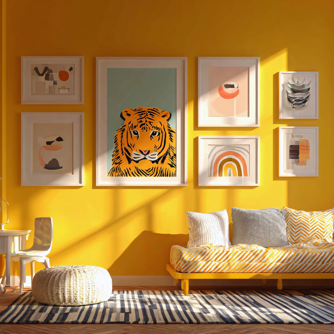

Using colour in a room can bring life and personality, but doing so without overwhelming the space requires balance and intention. The key is to choose a restrained colour palette and use accents deliberately to create harmony. This avoids a cluttered or chaotic look.
It often helps to select one dominant colour and pair it with complementary neutrals or softer shades. This approach allows colour to enhance the room rather than dominate it. Thoughtful placement of colourful elements also plays a crucial role.
By controlling saturation and working with natural light, anyone can introduce vibrancy while maintaining a calm and inviting atmosphere. These strategies make decorating with colour manageable and visually appealing.
Fundamental Principles for Decorating With Colour
Successful colour use in interior design involves understanding how hues interact, creating balance, and using a neutral base to avoid overwhelming a space. These principles guide thoughtful choices that enhance a room’s atmosphere without cluttering the visual field.
Understanding the Role of Colour in Interior Design
Colour influences mood, perception of space, and the overall aesthetic of a room. Warm tones like reds and oranges can create energy, while cool blues and greens encourage calmness.
Colours also affect how large or small a room feels. Light tones tend to open up a space, making it appear larger, whereas dark colours can add cosiness but may reduce perceived size.
Choosing colours that complement existing furniture and lighting is crucial. The goal is to create harmony without visual confusion or clashes that disrupt the design flow.
The Importance of a Neutral Base
Neutral tones on walls or large surfaces form a foundation that simplifies decorating. Whites, beiges, and soft greys provide versatility and allow accent colours to stand out without overwhelming the eye.
Neutral walls prevent a room from feeling cluttered, especially in smaller or multi-purpose spaces. They also offer longevity, as they remain stylish through changing trends.
Using neutrals makes it easier to change accent colours regularly through soft furnishings or artwork, enabling flexibility without extensive redecorating.
Using the Colour Wheel to Achieve Balance
The colour wheel is a practical tool for selecting colours that work well together. Complementary colours, positioned opposite each other on the wheel, create contrast but require careful moderation to avoid harshness.
Analogous colours, which sit side by side on the wheel, offer harmonious combinations suited to calm, cohesive designs. Triadic schemes use three colours evenly spaced to add vibrancy without chaos.
Understanding these relationships helps avoid overwhelming contrasts. Balancing colour intensity and saturation based on the wheel ensures a room feels unified and visually pleasant.
Strategic Applications of Colour Without Overwhelm
Careful placement of colour can enhance a room without dominating it. Using specific areas or elements to introduce bold colours maintains a balanced, inviting environment. This approach helps preserve neutral walls and overall calmness while adding interest.
Accent Walls and Focal Points
An accent wall is a single wall painted a bold colour to create a clear focal point. It should contrast with neutral walls to draw attention without overwhelming the space. Choosing the wall behind a key feature, such as a fireplace or headboard, works well.
The key is keeping the other walls neutral or softly toned. This prevents the room from feeling busy or cluttered. Accent walls provide depth and dimension without requiring an entire room to be painted boldly.
In rooms with natural light, vibrant colours for accent walls benefit from the illumination, making the colour pop without feeling heavy. For darker rooms, choose muted or matte bold colours to avoid excess saturation.
Utilising Statement Furniture
Statement furniture uses colour to attract focus and anchor the room’s style. Pieces like a brightly coloured sofa, armchair, or cabinet stand out against neutral surroundings. These items provide strong colour without painting walls or floors.
The key to success is limiting statement furniture to one or two pieces to avoid visual competition. Pairing bold furniture with neutral rugs, curtains, or floors maintains calmness in the overall room design.
Texture and finish also influence the impact. Velvet upholstery or satin gloss on furniture can add richness without extra colour. This approach allows colour infusion with practical functionality.
Incorporating Colour via Baseboards and Trim
Baseboards and trim are subtle canvases for colour use. Painting them in a contrasting or complementary bold shade defines architectural lines without overwhelming the room.
Using colour here elevates detail usually overlooked. For example, white baseboards contrast sharply against dark walls, while coloured trim adds personality to otherwise neutral rooms.
This method is effective because it introduces colour at eye level or lower, helping balance stronger colours found in furniture or accent walls. It’s a restrained way to bring cohesion and interest through calculated small-scale use.
Enhancing Your Space With Accessories and Textiles
Using carefully selected accessories and textiles can introduce colour and texture to a room without overpowering it. Thoughtful placement and pairing of items like artwork, rugs, and soft furnishings create balance and a cohesive look.
Art and Gallery Walls for Visual Interest
Artwork is a strategic way to add colour without filling every surface. He or she can choose a gallery wall featuring a limited colour palette within the frames to maintain harmony. Grouping pieces of various sizes adds depth and focal points.
To avoid visual chaos, spacing between artworks should be consistent. Neutral or monochrome frames keep the collection unified. One or two standout colours in the art tie the wall in with the rest of the décor.
Layering With Rugs and Throws
Rugs ground a room and introduce subtle colour and pattern without overwhelming. Selecting muted or soft-toned rugs with simple designs keeps the look calm.
Throws serve as accents on sofas or chairs. Using throws in complementary colours or gentle contrasts enriches the texture. Layering throws of different fabrics, like wool and cotton, enhances visual interest while maintaining softness.
Adding Vibrancy With Throw Pillows, Cushions, and Blankets
Throw pillows and cushions bring focused bursts of colour and can reflect seasonal changes or moods. They work best in varied sizes and shapes, but should not clash with the main furniture tones.
Blankets draped over furniture add warmth and an extra colour dimension. Choosing shades that echo or subtly contrast other accessories ensures the room stays inviting without feeling crowded. Mixing textures like velvet, linen, or knit adds tactile appeal.
Tips for Harmonising Colour in Residential Spaces
Careful colour selection ensures balance and visual interest without clutter. Effective use of patterns, textures, neutrals, and adapting tones to room function creates a cohesive interior design.
Creating Cohesion With Patterns and Textures
Patterns and textures link different colours and materials, helping unify a space. Repeating a specific colour in various patterns, like cushions or rugs, maintains harmony.
Mixing textures, such as smooth fabrics with rough wood, adds depth while keeping the atmosphere balanced. It prevents bold colours from dominating by softening their impact.
Limit patterns to a few complementary types to avoid visual chaos. Use scales of pattern (large and small) strategically to lead the eye through the room calmly.
Balancing Bold Colours With Neutrals
Neutral tones like beige, grey, or white act as buffers for bold colours, preventing them from overwhelming. Pairing a bright red or cobalt blue with soft neutrals softens the overall effect.
Bold colours work best as accents rather than wall colours in most rooms. This allows for colour pops that energise a space without making it feel cramped.
Use break points—neutral furniture or walls—to create breathing room. This balance helps maintain a sophisticated interior design rather than a chaotic or overly busy environment.
Adapting Colour Choices to Room Function
Functional rooms benefit from tailored colour schemes. For example, calming colours like soft blues or greens suit bedrooms to promote relaxation.
In contrast, lively bold colours such as burnt orange or bright yellow stimulate energy and are well-suited for kitchens or living areas.
Consider lighting and room size when selecting colour intensity. Smaller or poorly lit rooms may require lighter or muted colours to avoid feeling smaller or enclosed.